Wiener Linien
Graphic Designer, Illustrator
Branding, Information Design, Wayfinding
This speculative rebrand and information design for Wiener Linien, the public transport operator of Vienna, Austria, balances the history and modernity of the country’s capital.
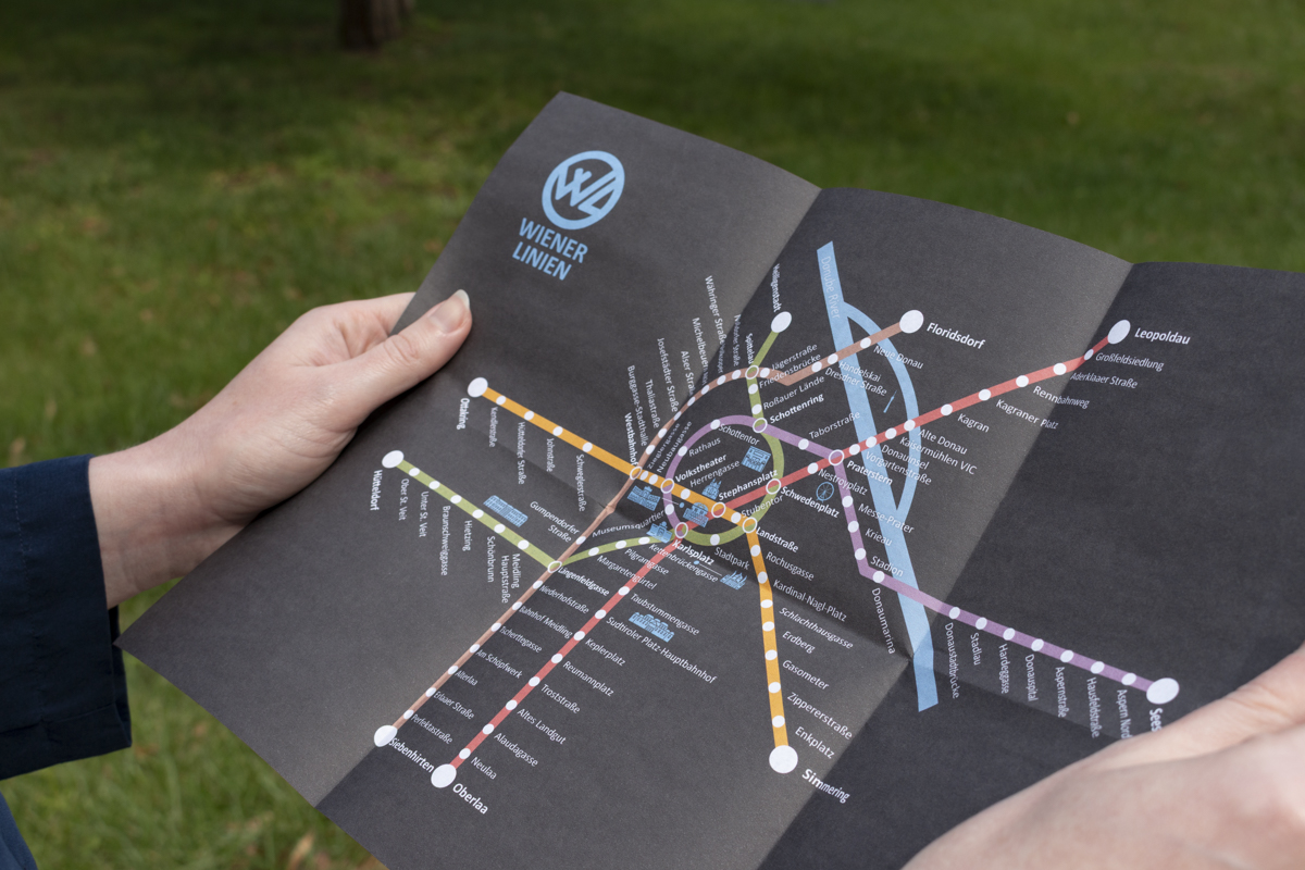
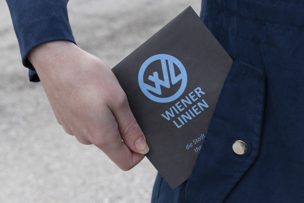
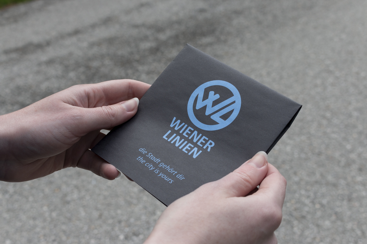
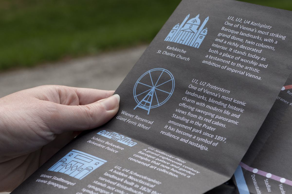
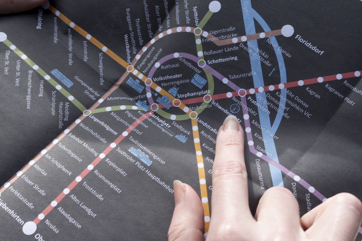
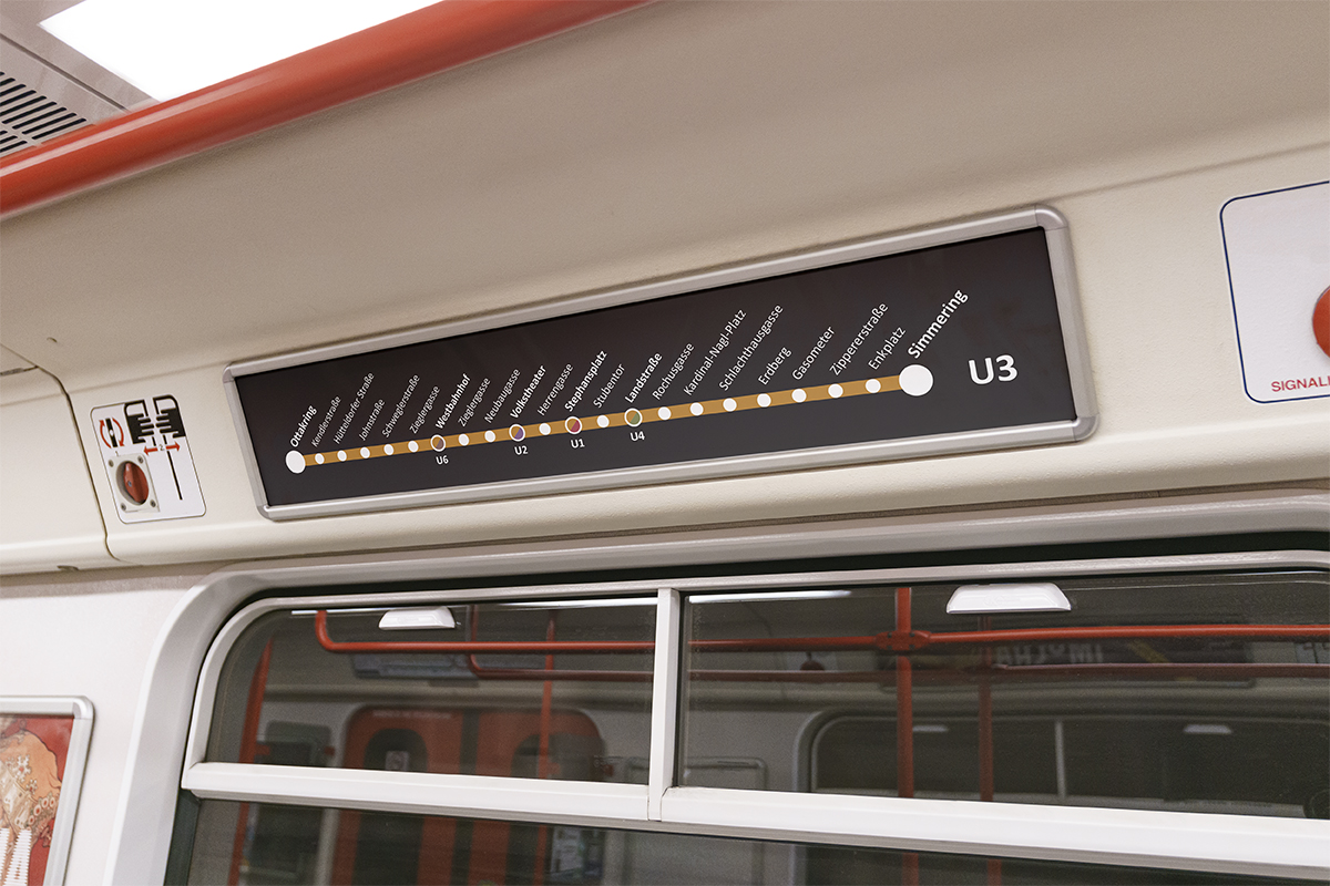
The redesigned logo infuses the easily recognized initials of Wiener Linien with history by using stylization inspired by the diamond-patterned roof of St. Stephen’s Cathedral and encloses them in a circle, evoking not only the subway tunnel but also seals, which represent authority and authenticity. The accessible and efficient map of its subway lines, subway stations, and 10 major attractions blends functionality with history to appeal to a wide target audience including both German-speaking locals seeking speedy transportation and English-speaking visitors seeking historic charm. The line colors retain existing color-coding but are adjusted to reference Vienna’s rich cultural history. The wayfinding continues the blend of history and functionality, providing subway users with an enjoyable and efficient experience.
The pocket-sized map folds simply to provide a frictionless experience to the traveler yet provides a sense of discovery as panels of helpful information on popular attractions are unfolded to reveal the subway map.
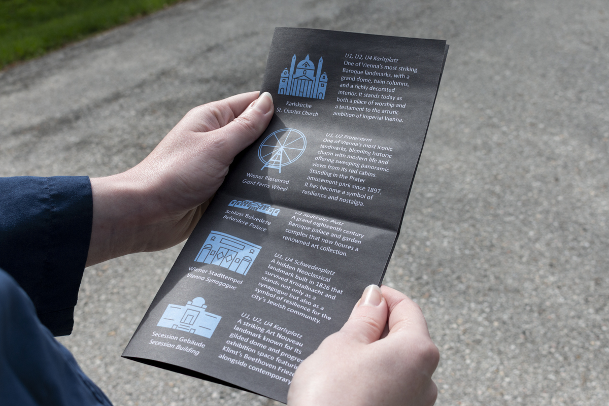
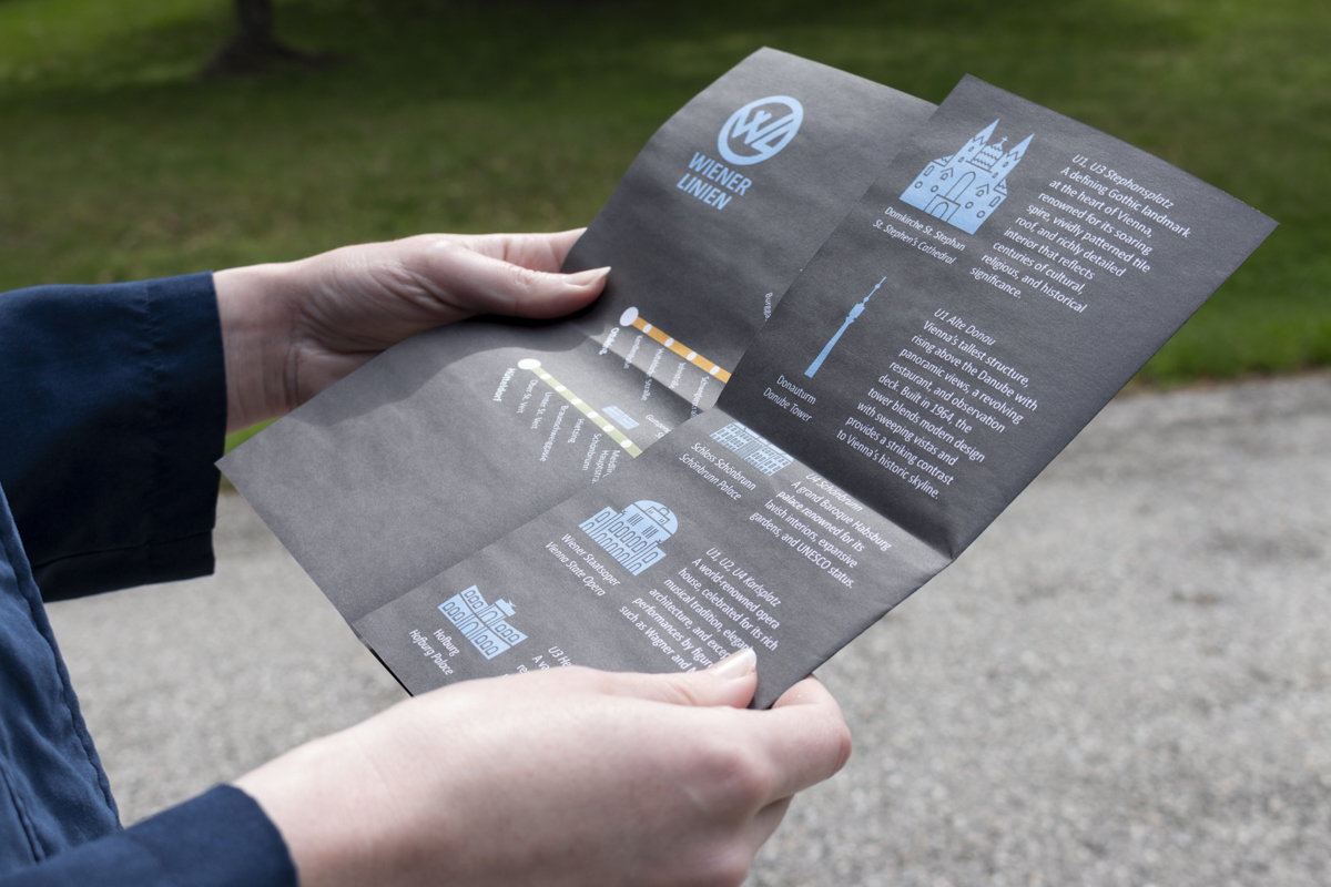
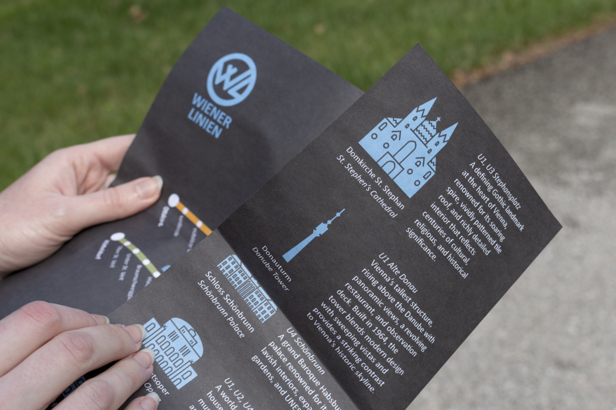
Icons on the back, alongside more detailed information including a description of key features, the nearest station, and bilingual labels, can be easily matched with icons on the map.
Wayfinding outside the station and inside the train seamlessly continue the design system of the map to efficiently guide travelers to their destinations.

The annual pass card extends the efficient and enjoyable experience to a compact touchpoint, showcasing the versatility of the design system.


 Next →