
Weleda
Amy Coker: graphic designer, website project manager
Brenna Morgan: graphic designer, packaging project manager
Makia Thomas: graphic designer, shipping project manager
Claudia Diaz: graphic designer, creative director, social media project manager
Branding, Packaging, Web Design, Social Advertising
Weleda is a natural skincare brand based in Europe. Despite its global reach and loyal customer base, it lacks brand awareness and recognition in some regions, including the United States.
The goal of this speculative branding, packaging, website, shipping material, and social media redesign is to make Weleda modern, memorable, and recognizable, appealing to a younger demographic without losing loyal customers. The clean and minimalist designs highlight Weleda’s natural ethos and offer the consumer premium feeling packaging that showcases the quality of the products. The website creates a user-friendly, cohesive, and immersive experience reflecting Weleda’s values and product quality. Fluid shapes are used throughout all physical and digital touchpoints to show the products’ luxurious texture.
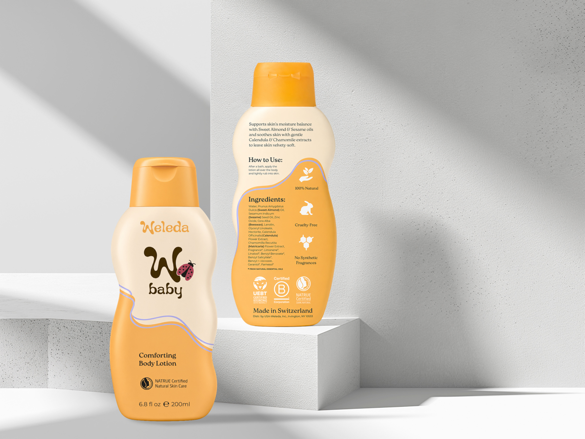
Our goal with Weleda Baby was to position it as soft and nurturing to resonate with new millennial mothers while also aligning with Weleda’s core branding. The flowing curves create a soothing ambiance, visually reassuring parents that Weleda’s products are safe for their child. To keep them cohesive, the Calendula and White Mallow versions of products use the same shapes. Swapping the colors makes them easy to recognize for busy moms with more than one product to grab.

Work from my teammates Makia Thomas (left) and Claudia Diaz (right).

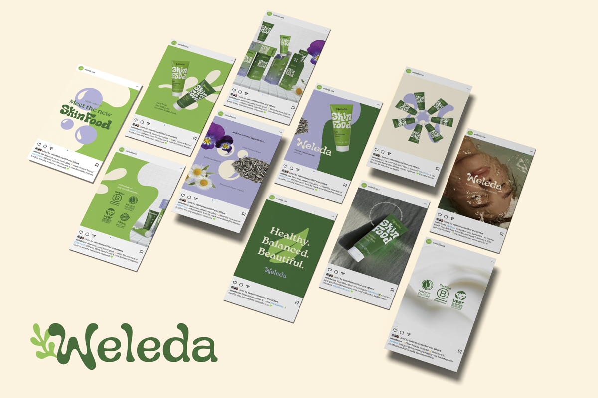
For the website, the goal was to create a user-friendly, cohesive, and immersive experience reflecting Weleda’s values and product quality. The brand messaging and trendy yet trustworthy tone of voice are used throughout the site to position the brand as modern, memorable, and recognizable.

Brenna Morgan and I collaborated to update the Weleda website. Below is our working prototype. If it doesn't load, please click here.

 Next →